Thursday, December 17, 2020
Development
Cover page
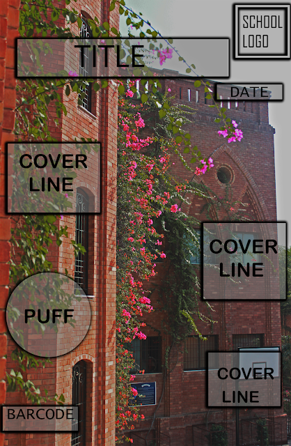
I first made a rough draft of what i wanted my cover page to look like at photoshop. By making this draft my vision got more clearer of what i wanted my magazine cover page to look like.
Content page
I did the same thing for content page.
Saturday, December 12, 2020
Fonts
I tried and used many different fonts for both my cover and content page. The fonts that i used are listed below
Paragrammarian Algerian
Paragrammarian PT Sans caption
Paragrammarian Oswald
Paragrammarian Anton
Paragrammarian Patrick hand
I didnt use one single font for my cover and content page as it seemed very plain so to change things a bit I used multiple fonts for both pages.
Sunday, December 6, 2020
Shots and Angles
Long shot:
Comparison of my preliminary task and final product
From my own learning experience when I was shooting for my preliminary task i struggled a lot with using the camera and lighting as I was ne...
-
1. They are never too good or too experienced to learn. The most successful nail techs – even those who are educators – continue taking cla...


