Tuesday, March 22, 2022

Comparison of my preliminary task and final product

From my own learning experience when I was shooting for my preliminary task i struggled a lot with using the camera and lighting as I was new to all this but during the time of my final project I had a good enough knowledge on how to get the perfect angles with good lighting and how to capture pictures better. If we take a look at my preliminary cover page it looks very childish and not professional the fonts used are the kind you don't use for a professional magazine, the content page and cover page of my preliminary task do not match in color theme. Whereas one the other hand my final project cover page has a professional look to it, following the basic codes and conventions of fashion magazine. My cover, content and double spread have a matching color theme. 

When I was using Photoshop the first time around I struggled with the tools and it took time to get a hold of it but when I was making my final project it was pretty easy for me to use Photoshop. It also encouraged me to try and explore new tools. To conclude I saw a lot of improvement in both my projects and learned a lot throughout these two projects.

Wednesday, June 23, 2021

Magazine Cover Page, Content Page and Double Spread


I wanted to keep my Magazine cover classy and minimal. However, as it’s a fashion magazine I also didn’t want it to be bland and colorless. I used Margins during the designing process as i was aware that during the printing process the edges can be cut according to the ‘bleed’. For my cover page I selected a color theme from the picture. With the help of image editing tools I edited the picture to make it sharper and more vibrant so all the colors are clear and bright. I used different fonts with different size and colours to make the page more eye catching. I used the bold and big masthead, the masthead is stretched from edge to edge. I used cover lines to catch the readers attention. I also used a png barcode and logos for the social media handles.


For the content page I selected a colour theme from the colours in my cover page. I used the shape tool to add shapes and also added different pictures so that the audience can be attracted by it. I did keep the double spread quite simple and ‘classy’ as i didnt wanted it to be too much.


For my double spread i kept the same theme as the content page. Dividing the page in half and then adding pictures and text related to nails. 


Monday, June 21, 2021

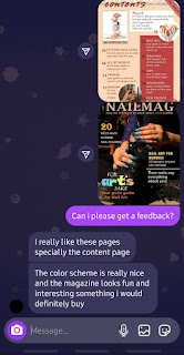
Feedback

This was the feedback that I received, after my feedback I decided to change my double spread.


Construction: Making of cover page

 Final work:


Rejected work:

This page was rejected because the name of my magazine was already taken so I had to choose a different name. Another reason why it was rejected was because the masthead was not stretched out from end to end which is a basic code of fashion magazines.


Process:


Construction: Making of the content page

Final work:


 Rejected work: 


This page was rejected because the masthead on this page was very simple and did not look appealing so adding drop shadow option to the masthead made it standout more. also the upper part of the magazine  looked very plain so adding summer issue in the top right corner filled out the emptiness. 


Process:


Construction: Making of double spread

 Final work:


Rejected double spread:


This page was rejected because the colour theme of this page didn't go with my other two pages. Another reason why it was rejected was because it did not look like a double spread but more like two completely different pages of the magazine. So for this page I had to completely redesign and make a new double spread that matched the colour theme and also looked like a double spread. 

Process 


Comparison of my preliminary task and final product

From my own learning experience when I was shooting for my preliminary task i struggled a lot with using the camera and lighting as I was ne...